Overall, I am extremely pleased with the outcome of my music magazine. I believe I have made the use of a variety of different programs, particularly Photoshop, to create a detailed realistic looking design, which had many of the conventions a real music magazine conveyed.
To start off with, I carried out a variety of research into similar media products. This involved carrying out short analysis of front pages, contents pages and double page spreads. I based my analysis on the media language, the ideological ideas of the magazine, the institution who was in charge of production, the audience who it was intended for, and how certain themes or people were represented. In addition to my research, I had to plan my music magazine effectively, to ensure that the production values were of the highest standard possible. For my planning, I had to work on layouts, drafting, and designing. In addition, I had to organise the photos, and the models, props, locations, and costumes that would be required for them.
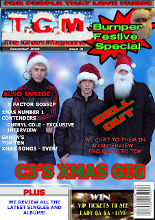
“TCM” definitely uses and develops forms and conventions of a number of real media products. My front cover for example uses a number of conventional elements of a music magazine. The big bold logo in the top left hand corner is a typical convention of all music magazines. I also use a main image which takes up the majority of the page which again is typical of all real magazines. The main image has also been cut out and the background blurred to make the image stand out.
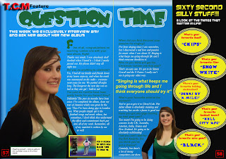
My media product has been specifically constructed in order to make the featured artists represent normal, cool and interesting people, who would appeal to the audience. For example, my interview on the double page spread talks about a variety of topics, including the music based questions and random questions such as what’s your favourite film and favourite food. These allows them to be represented as cool people. Also, the artists which feature in my magazine represent a number of different social groups. For example, the fictional artist on the front cover, “C3” represents a young pop group aimed at teenagers, and particularly girls.
The institution which distributes my magazine (or sub-institution) would be TCM. The type of institution that would be likely to distribute my media product would be a commercial institution, as a lot of the pages in my magazine would be primarily advertisements. This would create lots of profit for the institution making it highly successful. Also, the institution would already have a large, popular website and perhaps a related radio station which would all address the same audience.
When creating my magazine, I learnt a lot regarding the use of digital ICT. To do front page, double page spread and contents page, I used Adobe Photoshop. This allowed me to achieve the highest possible outcome because of Photoshop’ advanced technologies. I am now going to analyse my product in relation to the choices which I made and the outcomes.
My front cover uses a number of features of a “real” magazine. The pure function of a front cover is to attract the audience in, so it needed to be simple, clear and concise. I am now going to describe and then analyse the graphology of my magazine cover. Firstly, It uses a mast head, which is in the top left hand corner. This tells the audience what magazine it is, and also the positioning of the mast head is vital, as it is clearly visible on a rack. Underneath the masthead, is a date line, which tells you the date and issue number. Above the mast head, is a sell line, which says “for people that love music”. This is again used to draw the reader in. Then the left third of the cover has a short list of what’s actually in the magazine. This is used to attract the audience into buying the magazine. I also have a main image which takes up the majority of the page. This is the main artist which could potentially attract the audience’s eye, and get them to buy the magazine. I also have the barcode in the bottom right hand corner, as I found out by doing my research into similar magazine covers. I have two small sections at the bottom of my magazine, which indicate other features inside the magazine; one is a competition, the other is a review section. This again adds more clearly visible features to build up an image of the whole magazine for the audience. I also use a specific colour scheme, although I do at times move out of this magazine to illustrate the diversity of content in the magazine.
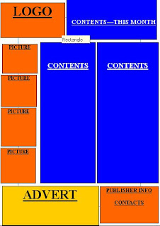
My contents page also uses a number of features of a “real” magazine. The pure function of a contents page is to give the reader an overview of the contents of the magazine, and the pages each specific feature is on. The contents page is split into thirds. The third on the left hand side contains two pictures. The remaining two thirds act as columns for the actual contents. In these two columns, I use big bold headings for each section of the magazine (i.e. features & reviews). This in terms of graphology splits up the page nicely and makes it much easier on the eye. I also leave appropriate spaces between each line, again to make it easier on the eye. After all, it is only a contents page and you want the audience to browse through the contents as quickly as possible. The top quarter of the page is split into two sections, a left and right one. On the left, like my front cover, is the logo. Then on the right is the heading “this month”. This has been done in a clear, bold, black font which has been underlined to make it stand out and tell the reader instantly that this is a page of contents. At the bottom of the page, I have again split it into two sections. One of them is an advertisement, getting the audience to subscribe to the magazine for an exclusive offer. This indicates straight away that this is a commercial institution, with an large audience and an extremely successful financial state. Also on my contents page, I make use of an appropriate colour scheme, which is primarily black and red. Along with the font scheme, this gives the page a better graphology, and it looks more attractive.
The double page spread also uses a number of features of a “real” magazine. I have one main image which stands out from the page. This main image takes up about two thirds of the left hand page, which fulfils the readers expectations of an expensive, commercial magazine. The audience want big colourful pages, with large pictures. I have a mast head at the top of the spread, which runs across both of the pages. Underneath it, I have a subheading which tells the reader in a nutshell what the article is about. The actual interview takes up two columns. The first column is on the first right third of the first page, next to the main image. The second column is on the first third of the second page. On the far third of the second page, I have a subsidiary feature, called “sixty second silly stuff”. This offers a change of reading to the reader which can be read in a glance. I also have an other picture at the bottom of the second page, which again, makes the page look visually attractive. I fully make use of a colour scheme, using blue, green, black and white primarily. Also, the shade of green is the same shade of green as the model’s top, so it the image follows the same colours as the text, to make an attractive graphological style to the page.
Looking back at my Preliminary task , I firmly believe I have learnt a great deal regarding progression to the main task. When I first made my college front cover, I only had a basic understanding of what conventions should be applied to the magazine. This was because I had only done a limited amount of research. However, before creating my main media product, I thoroughly researched a diversity of different music magazines, to maximise my understanding of the key concepts of a front cover, contents page, and double page spread.
In conclusion, I believe I have learnt a lot during this task, and as a result, have ended up with a professional looking magazine piece. Firstly, I believe I have successfully applied a number of conventional elements of a magazine which I have learnt from my research. Secondly, I have constructed the images and style of the magazine specifically to represent a younger audience and to be aimed at them as well. In other words, there is a clear relationship between the representation of the models portrayed and the audience it is aimed at. Thirdly, I believe I have learnt a lot of digital ICT technologies. And all of this has lead to, in my opinion, a amazingly realistic final product, with a number of professional elements.
Wednesday, 24 March 2010
Tuesday, 23 March 2010
UPDATE: Front Cover
Following a number of suggestions from the audience, I have decided to make a few alterations to my Front Cover. The Contents page and Double page spread will stay exactly the same and the final versions of those can be found in the previous post.
FINAL FRONT COVER
Friday, 19 March 2010
My Final Work
I have now fully completed the construction part of the task, and my results are below.
FRONT COVER
CONTENTS PAGE
DOUBLE PAGE SPREAD
NOTE: The divider down the middle of the page is purely to illustrate where the centre of the page is. When this is is a printed format, the line would be taken off prior to printing.
Tuesday, 9 March 2010
Photo Planning (Contents page & double page spread)
I have arranged to take my pictures with the following in mind.
Props - no props will be needed for the photographs
Models - Rob & Amy
Location - after looking around various parts of the college, I have found the best place is against a white wall in the wilson building. This is so the background can easily be edited out.
Costumes - casual clothes need to be warn - nothing fancy because of audience related factors.
Friday, 5 March 2010
Mock up of all my pages
Here I have transferred what I had on paper to computer, and have used digital ICT to develop my ideas on the layout. Now that I have a strong idea on the layout of my magazine, i can now start to construct it.


